New
Apr 12, 2013 8:36 AM
#1

notice: use the browser extension Stylus, not Stylish i hope you like it! it tweaks a lot, though it's not to everybody's taste ^-^/ goal: symmetricality, friendly appearance & not looking like a 90's site ;) compatibility: chrome/vivaldi/opera 15+ (great) firefox (good enough?)   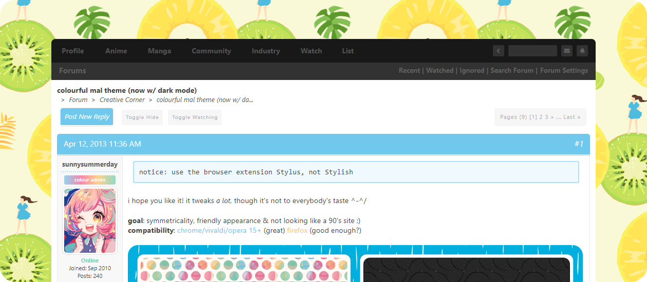 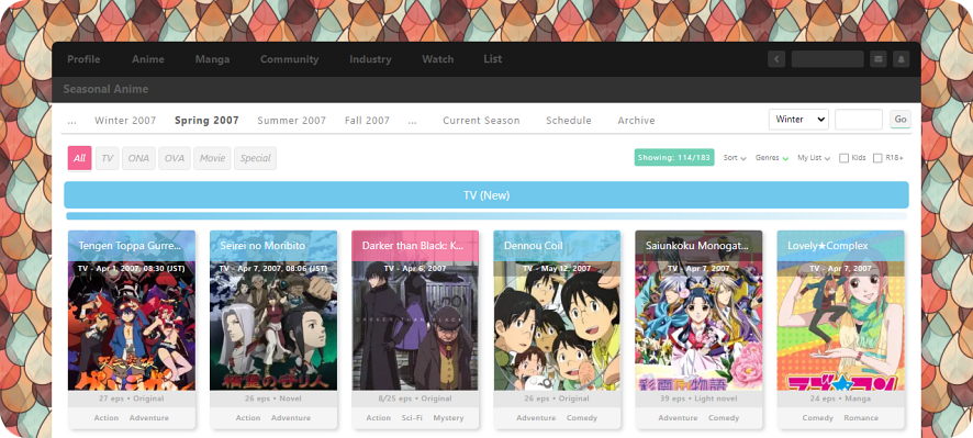 install (in this order!): crayon for mal + optional styles below. -- optional: custom (if you want to alter the background, edit stuff, etc.) (this seemed necessary to avoid my updates undoing your changes.) -- bonus: modern (style anime pages differently - bigger & more colourful.) -- ( ⚆ _ ⚆ ): dark  don't be shy about telling me if something looks weird and/or is broken! animated background  to remove the animation, install "crayon (custom)" and add this code: /* Disable background animation */
body {animation: none !important;}to modify the animation, add this near the top: /* Animated pattern */
body {background-attachment: fixed !important;}
:root {
--size: 200px 200px;
--speed: 25s;
}to change the direction it moves in, use any of these in place of what's above: 200px 200px = top left to bottom right (default) -200px 200px = top right to bottom left 200px -200px = bottom left to top right -200px -200px = bottom right to top left 200px 0px = left to right -200px 0px = right to left 0px 200px = top to bottom 0px -200px = bottom to top tips.. if your image isn't 200px 200px, change those numbers. to increase the speed, lower "--speed: 25s" (25 seconds). to make this work in firefox: BAD = body {background: url(PLACE_IMAGE_URL_HERE) repeat #fafafa !important;}
GOOD = body {background-image: url(PLACE_IMAGE_URL_HERE) !important;}..though firefox animation seems choppy unless sped up. change the background to remove the background, install "crayon (custom)" and delete the .png url that's inside, so that it looks like: background-image: url() !important; for a different pattern, you can visit colourlovers, find a pattern and copy its "preview" image url (top left). to apply this theme's colour scheme to a colourlovers pattern, use this palette and choose "create pattern". alternatively, find a pattern and choose "color this pattern": #70c8ed #f46592 #ffc46c #fffaf5 #70d0b6 change the colour scheme  you can change any of the five primary colours (blue, pink, orange, green, purple) easily: /* Colours */
:root {
--colorBlue: 112,200,237;
--colorPink: 244,101,146;
--colorOrange: 255,196,108;
--colorGreen: 112,208,182;
--colorPurple: 140,125,208;
--colorLightBlue: 240,248,252;
--colorBlueShadow: 112,200,237; }install "crayon (custom)" and add that code at the top, picking your own RGB (not hex) values. (there are also other variables at the top of the main theme that you can look at and change.) change the image curves to revert back to the much more square-ish look, or get creative with non-symmetrical shapes: /* Original image curves */
:root {
--curve: 3px;
--curveAlt: 3px;
--curveGrand: 3px;
--curveImage: 0;
--curve8px: 5px;
--curve4px: 3px;
--curve3px: 2px; }/* Change image curves */
:root {
--curve: 10px; /* Can use values like 8px (all) or 30px 10px 30px 10px (top left, clockwise) */
--curveAlt: 8px; /* Use 2px less than above, or use the same with some (maybe unnoticeable) issues */
--curveGrand: 16px; /* Main image for Profile, Anime, Character, News articles, etc. */
--curveImage: 12px; /* User submitted images in comments and forum posts */
--curve8px: 8px; /* Boxes (Char/VA on Anime pages, comments, friends, etc.) */
--curve4px: 4px; /* Nav/forum/input buttons, spoilers, tags, etc. */
--curve3px: 3px; /* Mostly small buttons like add/edit */ }change the edit buttons add and change the below code to choose your own text (because i know "now" & "done" are a bit weird.) 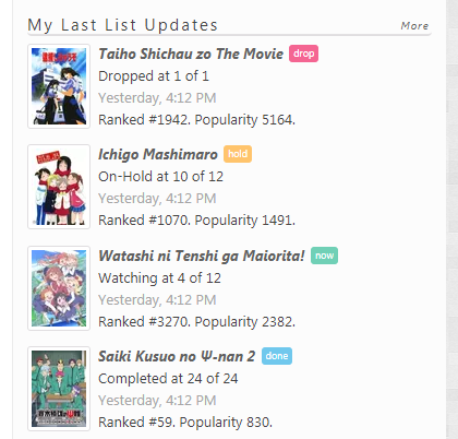 /* Change 'edit' button text */
.button_edit.watching:after, .modal-icon div.watching:after {content: "now";}
.button_edit.reading:after, .modal-icon div.reading:after {content: "now";}
.button_edit.completed:after, .modal-icon div.completed:after {content: "done";}
.button_edit.on-hold:after, .modal-icon div.on-hold:after {content: "hold";}
.button_edit.dropped:after, .modal-icon div.dropped:after {content: "drop";}
.button_edit[class*="plantowatch"]:after, .modal-icon div.plantowatch:after {content: "plan";}
.button_edit[class*="plantoread"]:after, .modal-icon div.plantoread:after {content: "plan";}trouble finding stuff?  recommendations on anime/manga pages / hover the "i" for the main rec. 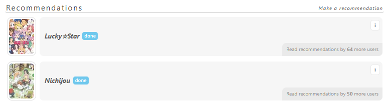 "my panel" page / there's no mal logo, but you can still click where it was. profile comments/forum posts / options (edit, delete, etc.) are hover only. report club / hover only (large red bar) at the very bottom of a club page. faq / for "faq", "about", etc. hover near the bottom (middle) of any page.  messages & notifs nothing new:  new & new:  new & unread: 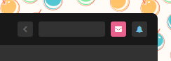 search box selector default:  hovered:  notes:
plan to edit a lot?  get familiar with your browser's right click menu option "inspect." use it anywhere on the site where you want to edit something, and it'll show you the exact codes being used so that you know what to look for in my theme. copy only what you changed into "crayon (custom)" and place them after the "body" code: body {
background-image: url() !important;
}
/* Place codes below */
#fakeCode.deleteMe {display: none !important;}also, make sure all codes have "!important;" after them rather than just ";" - so that they'll always override. recommendations if you don't like the default look for recommendations, try adding some of these to "crayon (custom)": /* Recommendations (Always show full titles) */
.anime-slide-block .title {display: block !important;max-height: 90px !important;}
/* Recommendations (Always show full titles, hide upon hover) */
.anime-slide-block .title {display: block !important;max-height: 90px !important;transition: 0.1s !important;}
.anime-slide-block .btn-anime:hover .title {opacity: 0 !important;}
/* Recommendations (Always hide user total) */
.anime-slide-block .users {display: none !important;}
/* Recommendations (Always show user total) */
.anime-slide-block .users {top: 0 !important;}
/* Recommendations (Hide auto recs) */
.btn-anime.auto, #v-auto-recommendation-personalized_carousel {display: none !important;} /* Recommendations (White shadow for titles) */
.anime-slide-block .title {
background: inherit !important;
background-image: url("https://i.imgur.com/eaTfSkV.png") !important;
box-shadow: 0 2px rgb(255 255 255 / 90%);
text-shadow: black 1px 1px 5px !important;
color: white !important; } /* Recommendations (Original title look) */
.anime-slide-block .title {
background: inherit !important;
background-image: url("https://i.imgur.com/dBXXLvp.png") !important;
border-radius: 0 0 3px 3px;
color: white !important;
display: block !important;
font-size: 11px !important;
font-weight: 600 !important;
line-height: 1.2em !important;
max-height: 104px !important;
box-shadow: 0 2px rgb(0 0 0 / 90%);
text-shadow: rgb(0 0 0 / 80%) 1px 1px 0 !important; }various modifications this is just a minor tweak to slant the stacks text on anime/manga pages. (it doesn't render nicely in firefox though.)  /* Slanted stacks text (Anime/Manga pages) */
.detail-stack-block .column-item .detail .title {margin: 20px 10px 10px 30px;transform: rotate(-5deg);}
.detail-stack-block .column-item .detail .stat {top: 10px;left: 20px;transform: rotate(5deg);}to remove stuff you never use from the "edit entry" page (when you click add/edit buttons), use these: /* Edit entry page (Hide specific parts) */
#top-submit-buttons {display: none !important;} /* 'Submit' & 'Delete' (Top buttons) */
#main-form table.advanced tr:nth-child(2) {display: none !important;} /* 'Priority' */
#main-form table.advanced tr:nth-child(3) {display: none !important;} /* 'Storage' */
#main-form table.advanced tr:nth-child(5) {display: none !important;} /* 'Re-watched Value' */
#main-form table.advanced tr:nth-child(7) {display: none !important;} /* 'Ask to Discuss?' */
#main-form table.advanced tr:nth-child(8) {display: none !important;} /* 'Post to SNS' */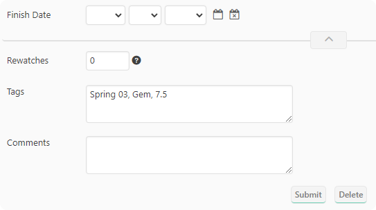 /* Edit entry page (Swap parts) */
#main-form table.advanced tr:nth-child(1) td {position: relative;top: 43px;} /* Move 'Tags' down */
#main-form table.advanced tr:nth-child(4) td {position: relative;top: -75px;} /* Move 'Re-watched' up */only use the above code if you hid all the other parts. to hide a bunch of things across the site, add some of these: /* Hide score/promo section (Anime/Manga page) */
.breadcrumb + table td[valign="top"] > .pb16, .breadcrumb + table td[valign="top"] > .pb24 {display: none !important;}
/* Hide just the score (Anime/Manga page) */
.anime-detail-header-stats .stats-block .score,
.anime-detail-header-stats .stats-block:before {display: none !important;}
.anime-detail-header-stats .score + div {margin-left: 8px !important;}
/* Hide video promo (Anime page) */
.anime-detail-header-video {display: none !important;}
/* Hide episodes (Anime page) */
div#episode_video.anime-slide-block {display: none !important;}
/* Hide 'Watch Episodes' button (Anime page) */
#broadcast-block {display: none !important;}
#broadcast-block + .mt8 {margin-top: 12px !important;}
/* Hide profile badges */
.profile .user-status.border-top.mt12.mb12 + h4.mb8, .profile .user-badges.di-b {display: none !important;}
.user-compatability-graph.pl4.pr4.pb12 {margin-top: -10px !important;}
/* Hide custom forum titles */
.custom-forum-title {display: none !important;}
/* Hide floating navigation (Seasonal page) */
.navi-seasonal.fixed {display: none !important;} additional backgrounds  visit colourlovers for patterns/bg's and ->here<- for ones i've "loved."    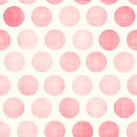         ⎻⎻⎻⎻⎻⎻⎻⎻⎻⎻⎻⎻⎻⎻ ⎻⎻⎻⎻⎻⎻⎻⎻⎻⎻⎻⎻⎻⎻credits: main bar base (Modernized) | a few other ideas (re[MAL]) oh, and: psst! be nice & tell a friend! they might love you for it :)?  |
sunnysummerdayFeb 18, 8:07 AM
Apr 13, 2013 4:48 AM
#2

| Pretty colors and easy-on-eye design, I would like to try it :) |
riot_riotApr 13, 2013 6:33 AM
Apr 13, 2013 6:55 AM
#4

| wow, this looks so cute and pretty. i really like the color combination :3 |
Apr 13, 2013 7:50 AM
#5
| i of course plan to share with everybody! i'll probably add in even more cute colour schemes ~@_@!! |
Apr 13, 2013 7:56 AM
#6
| Lol, you're awesome! it'd be nice if MAL had a similar interface as to this. |
Apr 13, 2013 9:51 AM
#7

| It is possible to change the background? because that is the only thing I don't like :P |
Apr 13, 2013 10:07 AM
#8

| Looks nice :D Can't wait to see it in action! |

Apr 13, 2013 10:12 AM
#9

| This is soooo cute. Usually I don't download these types of themes because my computer is slow as it is - but I would go for this theme. It's too cute to pass up! |
"Cheer up, you’re never alone! There is probably at least 1 bug in your room." |
Apr 13, 2013 6:28 PM
#10

| I appreciate the detail that's gone into the circles in the background, it's subtle but really gives them a lot of depth and adds to the feel of the theme. Very nicely done ^_^ |


Apr 13, 2013 7:41 PM
#12
Kamio-chan said: I appreciate the detail that's gone into the circles in the background, it's subtle but really gives them a lot of depth and adds to the feel of the theme. Very nicely done ^_^ that background is a pattern template from COLOURlovers [link] that somebody else made, but with my colours! :O lupadim said: Wait, is there a way to change forum layout? stylish (browser extension) lets you alter practically everything on a website, so, i've cleaned up the forums a bit! |
Apr 14, 2013 7:06 AM
#14

| Not too sure about the background, but other than that I really love it, can't wait to try it! |
  |
Apr 14, 2013 7:12 AM
#15

| It's totally cute :P but I wonder if we can customize the background..xDDD |
 |
Apr 15, 2013 5:21 AM
#16
sunnysummerday said: Kamio-chan said: I appreciate the detail that's gone into the circles in the background, it's subtle but really gives them a lot of depth and adds to the feel of the theme. Very nicely done ^_^ that background is a pattern template from COLOURlovers [link] that somebody else made, but with my colours! :O Regardless, it looks great, good colour choice. |
Apr 20, 2013 8:42 PM
#17

| I think it looks AMAZING. I can't wait for it to be done! :D |
 |
Apr 21, 2013 6:21 AM
#18

| I will definitely give this a try :) Have to see it in Action and in Fullscreen to know if it fits my Taste or not |
Apr 22, 2013 3:27 PM
#19
| it's finished.. z_Z.. |
Apr 22, 2013 3:38 PM
#21
sunnysummerday said: it's finished.. z_Z.. AWW YEA! :D |
Apr 22, 2013 3:48 PM
#22

| Amazingly done. My only complain would be: there's no caps at all... |
 |
Apr 22, 2013 4:25 PM
#23
Hederick said: take a look at the first post again:Amazingly done. My only complain would be: there's no caps at all... sunnysummerday said: lowercase? everything's lowercase! excluding the reviews and recommendations. you don't like it though? delete this line from the very top of the code: <pre><pre><pre><pre><pre>text-transform: lowercase !important; if you want reviews and recommendations to be lowercase, search and delete all instances of "text-transform: none;" i'm giving it a try atm. i still have to get used to some colors (already changed the background because it was a bit too much for me :D), but it definitely does look nice :) |
HaibaraApr 22, 2013 4:30 PM
Apr 22, 2013 5:00 PM
#24
thankyouthankyouthankyou :) if anyone's annoyed with something i changed, i can help to fix it for you! yay world peace and stuff like that. also, i hope that "<pre><pre>" stuff in the code box (^ above post, behind spoiler) doesn't confuse people.. mal seems to add those when you edit a post that has the [ code ] bit in it. why?!! yep, because of monkey's :l |
Apr 23, 2013 5:34 AM
#26
| Looks good :) Will definitely use it How can i change the Link Color in the Top Menu? I don't really like grey on grey/black. Did you set it up so every Link is that greyish or can i specifically only change those? |

Apr 23, 2013 12:31 PM
#28
sibbo7 said: How can i change the Link Color in the Top Menu? for the very top bar, search for "#555555" and change it to a colour you want. #686868 is right below that, and changes the colour when hovering those links. #606160 is the text for the second bar (and the search bar text) with 6 instances. i hope that helped D: |
Apr 23, 2013 4:25 PM
#29
| This is really cute, I have changed the wallpaper to something a little plainer but I absolutely adore everything else about it ♥ |
| |
Apr 23, 2013 4:43 PM
#30
| Awesome. Good job, and thanks for sharing! :D |
Apr 26, 2013 9:26 PM
#31

| Found a reason to use Opera now. Greaaaaaaat. Will now try to persuade everyone I know into this. |
Apr 26, 2013 11:41 PM
#32

Thanks for the great theme. I'm not as colorfully-inclined so I combined it with one of suffix's old themes and came up with a hybrid that I like. :3 |
 I am a banana. |
Apr 27, 2013 12:48 AM
#33
| that's bizarre-o looking, but interesting! anything's better than the default, so tweak away :} |
Apr 29, 2013 10:41 AM
#34

Apr 30, 2013 7:51 AM
#35

| It's really... cute... the colors. Might do a little editing but thanks for this. I do have one question though, well more like two. How to make it so the quote/edit/report/etc buttons stay out instead of only appearing if hovered? Same with the toggle watching. |
PaulApr 30, 2013 8:02 AM
Apr 30, 2013 8:12 AM
#36

| It's nice, but how do you turn the upper bars into rounded squares? EDIT: Also, how do you set it so the background doesn't repeat? |
 |
Apr 30, 2013 8:13 AM
#37
| @Paul add these codes to the "custom" css: #forum_options_container ul {opacity: 1 !important;}any changes you make should be copied to the custom css so that my updates don't overwrite them :) @yhunata add this to the custom css: #menu {border-radius: 0 !important;}..and for the background, in the custom css, change the "repeat" part of "background: url.." to "fixed" (at the top.) |
sunnysummerdayApr 30, 2013 8:18 AM
May 1, 2013 7:22 AM
#38
| For those who prefer blue menus, here is the code for my hybrid with suffix's Air theme. I also tweaked a few other things. Just put it the following in the custom part of this style: body { text-transform: none !important; background: url('http://i.imgur.com/xxUb9TA.jpg') top center no-repeat #fff !important; } .ra1-pw-classicWidget {display: none !important;} #header, #headerSmall { height: 150px !important; } h1 { background-color: #e1e7f5 !important; } /* no wrapping of tabs */ .normal_header { white-space: nowrap; overflow: hidden; } /* change hot pink back to blues */ #horiznav_nav ul li a.horiznav_active { background-color: #36b !important; } div[style*="background-color:#eaf0fa"] {background-color: #eaf0fa !important;} div[style*="background-color:#dbe5f6"] {background-color: #dbe5f6 !important;} div[style*="background-color:#cddbf2"] {background-color: #cddbf2 !important;} div[style*="background-color:#bdceec"] {background-color: #bdceec !important;} div[style*="background-color:#b0c4e8"] {background-color: #b0c4e8 !important;} div[style*="background-color:#a3bae3"] {background-color: #a3bae3 !important;} div[style*="background-color:#96b0de"] {background-color: #96b0de !important;} div[style*="background-color:#8aa7d8"] {background-color: #8aa7d8 !important;} div[style*="background-color:#7c9acf"] {background-color: #7c9acf !important;} div[style*="background-color:#7191c8"] {background-color: #7191c8 !important;} div[style*="background-color:#6687c0"] {background-color: #6687c0 !important;} div[style*="background-color:#5b7db8"] {background-color: #5b7db8 !important;} div[style*="background-color:#5073af"] {background-color: #5073af !important;} div[style*="background-color:#476aa6"] {background-color: #476aa6 !important;} div[style*="background-color:#3e619d"] {background-color: #3e619d !important;} div[style*="background-color:#365a97"] {background-color: #365a97 !important;} div[style*="background-color:#2f528f"] {background-color: #2f528f !important;} div[style*="background-color:#274a86"] {background-color: #274a86 !important;} /* top menu */ #menu { background-color: #36b !important; } #searchBar:before { background: rgba(200,200,200,0.75) !important; } #topSearchText { background: rgba(255,255,255,0.5) !important; } #topSearchText:hover, #topSearchText:focus { background: #99beff !important; } #topSearchValue { padding-bottom: 8px !important; } #nav ul { background-color: rgba(51,102,187,1) !important; box-shadow: 7px 7px 7px rgba(18,18,18,0.5); border-top: 0px solid #88aeff; } #nav li a, #nav li.hover a, #nav li a:visited { color:#f0f0f0 !important; white-space: nowrap; /* fixes display bug for char db in admin menu */ } #nav li a:hover { color:#f0f0f0 !important; } #nav li.hover ul li a { color: #88aeff !important; } #nav li.hover ul li a:hover { color: #f0f0f0 !important; } |
I am a banana. |
May 1, 2013 7:56 AM
#39
| Oh my god, this is actually so freaking cute. Thank you! |
     I am the senpai that notices you. |
May 6, 2013 5:49 AM
#40

| This is really cute. :) I love it. |
May 12, 2013 6:20 AM
#41

| This is adorable! ;w; |
 |
May 18, 2013 5:22 PM
#42

| This theme fits my tastes so well, you have no idea. I love this, truly. You've done an amazing job. <3 |
May 18, 2013 6:38 PM
#43
Selaphi said: This theme fits my tastes so well, you have no idea. I love this, truly. You've done an amazing job. <3 i'm going to pretend that with chi as your avatar, she is telling me this, and thus, be eternally happy (thanks!) :3 |
May 18, 2013 10:25 PM
#44
sunnysummerday said: Selaphi said: This theme fits my tastes so well, you have no idea. I love this, truly. You've done an amazing job. <3 i'm going to pretend that with chi as your avatar, she is telling me this, and thus, be eternally happy (thanks!) :3 If everyone had a Chi to tell them nice things everyday the world would be a happier place. :'D ( nyan ) |
May 19, 2013 5:50 AM
#45

| looks very nice |
 |


Sep 26, 2013 10:31 AM
#47
| this might be a bit stupid to ask, but... i'm new to this kind of thing so please forgive me... is this view-able to visitors? or am i the only one who sees it? |
Sep 26, 2013 3:47 PM
#48
| only the people who have it installed will see it, sadly! so that's just you, myself and that person over there.. :p |
Sep 29, 2013 10:22 PM
#49

| must be try. :) |
| Signature removed. Please follow the signature rules, as defined in the Site & Forum Guidelines. |

More topics from this board
» Four Ages!Robert_SS_Gordon - Feb 21 |
11 |
by Robert_SS_Gordon
»»
Yesterday, 10:41 AM |
|
» How to Export/Backup Your Anime List Automatically! (TamperMonkey Script)hacker09 - May 18, 2020 |
15 |
by hacker09
»»
Yesterday, 9:50 AM |
|
» Do people really customize their list?scharfkun - Mar 25 |
8 |
by Retro8bit
»»
Mar 27, 11:20 PM |
|
» Just another Dark list designHan-yuu - Mar 23 |
6 |
by Shishio-kun
»»
Mar 26, 3:47 PM |
|
» Share Your YouTube Channel/Videos! ( 1 2 3 4 5 ... Last Page )nin-tendo - Dec 16, 2022 |
512 |
by nin-tendo
»»
Mar 26, 1:08 PM |